Evolving Prudential.com
Role: UX Design Lead
Length of the project: January 2022 - April 2023
Tools used: XD, Excel, Sharepoint, Miro, Airtable, UserZoom
Summary
The entirety of Prudential.com is moving from the WCM content management system to Adobe’s AEM CMS. The Pru.com UX team led the design effort to create 800+ wireframes redesigning each site page.
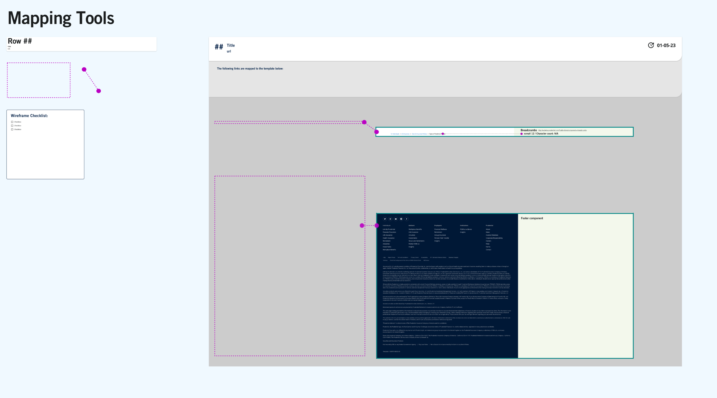
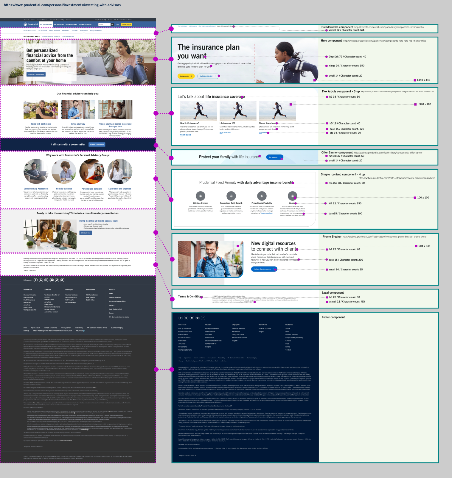
Along with ensuring that each page is built with components currently available in AEM, we also aligned cross-team collaboration in weekly working sessions to map and translate legacy components into EVO design system components which provide a more modern and cohesive experience.
Problem Statement
How might we visualize the full scope of Pru.com and create a collaborative and efficient system to redesign hundreds of pages with our development partners?
Goals
Creating a system to redesign, approve, and communicate changes to hundred of pages
Meet our development partners’ urgent and changing deadlines
Evolve the way we work together to facilitate transparency and collaboration
Battle siloes in workflows and understandings
Ensure new page designs align with the EVO Design System
Bridge knowledge gaps about Design System components
Constraints
The migration project needed to start before roadmap planning could be completed. The UX team was challenged with creating a flexible workflow to wireframe all migration pages and help our teams navigate short timelines and rapidly-changing priorities.
The challenges we overcame in this project:
Unclear team understanding of the full scope of pages to migrate, and how page components would be prioritized
Designers must adhere to existing Design System components, or create new components to add to the Design System
Development teams require large amount of wireframes in a short timespan
Process Details
Interviewed the Product team to get a sense of the requirements, scope and goals
Created a sitemap to visualize the current structure of the site and different levels of content hierarchy
Visually grouped screens together to identify repeating component patterns
Used learnings to create audited list of pages to wireframe excluding duplicate and broken links
Mapped wireframe to existing components
Adjusted for feedback from Creative, Product and Development teams
Scoped requirements for new or enhanced components with Product and Development teams
Refined with internal Development team, conducted feedback and approval rituals
Handoff to external Development partners
User Research
To understand best practices and trends within our target space and amongst out competitors, we conducted a heuristic competitive evaluation and referenced NNgroup best practices. Since Prudential is lucky enough to have a strong Design System team, we were able to design our wireframes using approved components from the EVO Design System which is guided by user research.
Visual Artifacts
Heuristic evaluation
Competitive evaluation
Working Session facilitation boards
Sitemaps
Wireframes
Mockups
Prototypes
Final Mockups
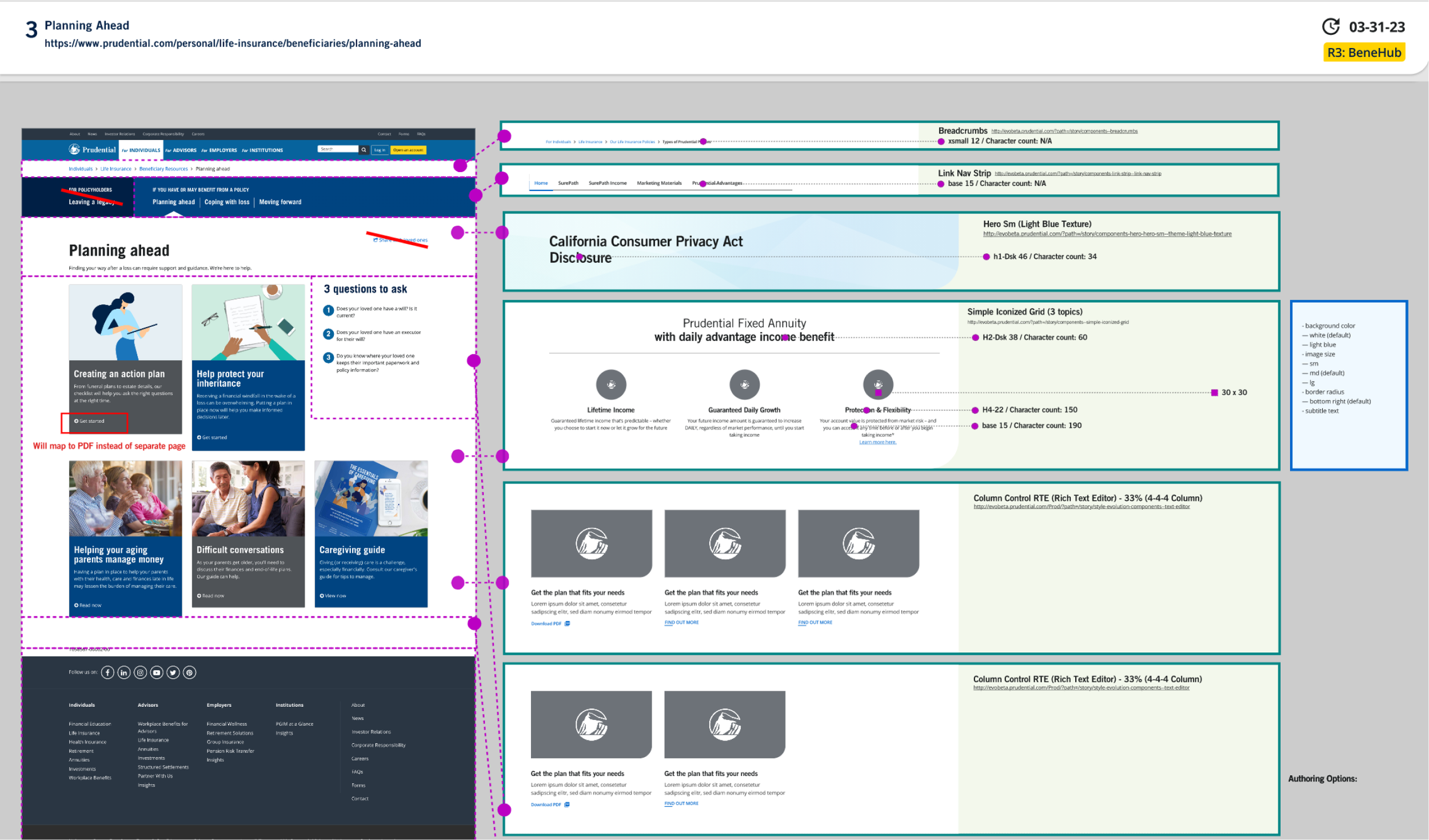
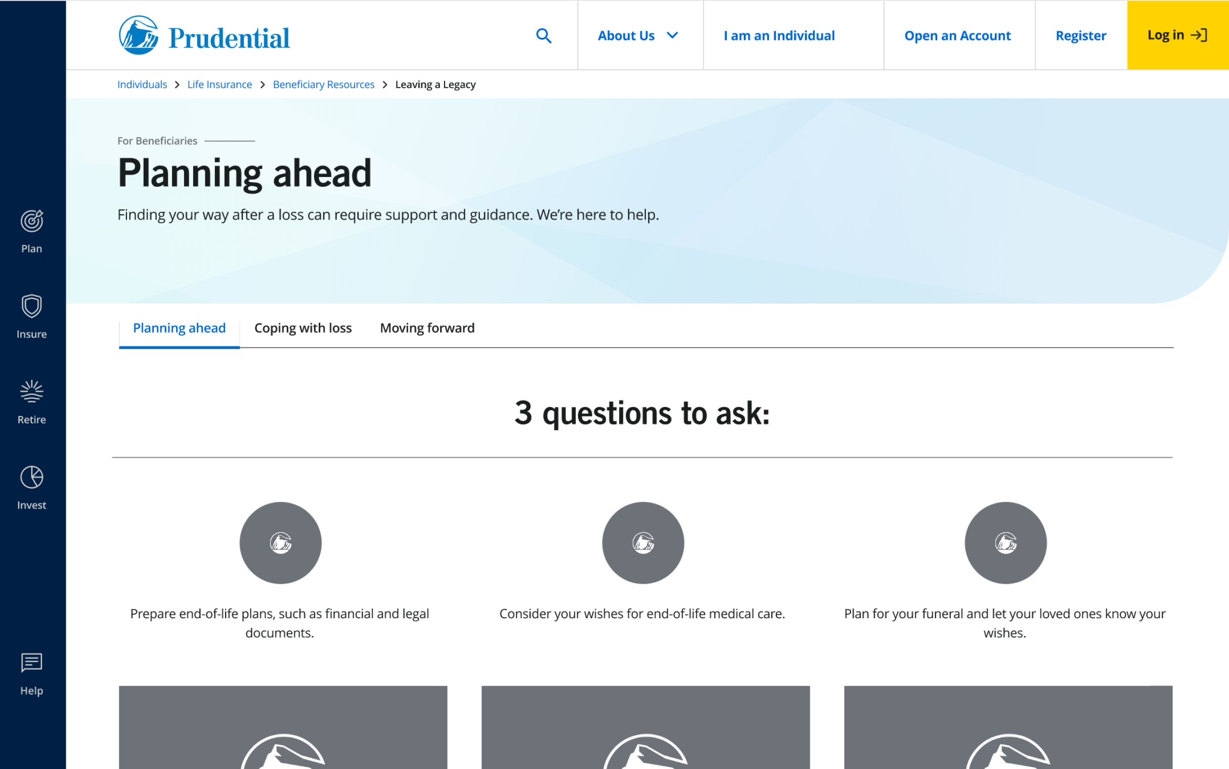
In most cases, the “annotated wireframes” as they came to be called, were our final mockups, delivered to our development partners via an excel sheet list of XD links to wireframes. However, where the experience or user flow was more difficult to understand, we created hi-fi mockups to pair with the wireframes.
The overall goal was to show both the components and specs, as well as how the components would be laid out on the page with content.
Success Metrics
Meeting our development partners deadlines
Efficiency and time spent communicating page designs both sync and async
Improvements to baseline user experience in user testing and feedback
Lessons Learned
The importance of standardized number and naming systems for such a large group of wireframes
Cross-functional team approvals require a flexible mix of async and working-session style facilitation when short timelines are in place
Teams need clear and easy access to feedback tools


